The project
Building a scalable, user-friendly interface.
TwProject faced challenges with scaling due to a cluttered and inconsistent interface, which had developed over time as new features were added without a cohesive design strategy. The project aimed to simplify and standardize the user experience, creating a more intuitive and visually appealing product that could support future growth.
About TwProject
TwProject is a web-based project and groupware management tool created by Open Lab, an Italian software house founded in 2001.
twproject.com
My role
As the lead designer, I redefined the product's architecture, introduced a scalable design system, and improved the overall user experience.
The challenge
Addressing design inconsistencies to create a cohesive and intuitive product.
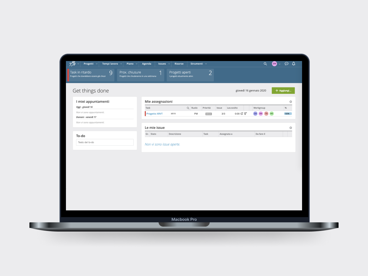
TwProject faced significant challenges as the accumulation of features over time led to a convoluted and inconsistent user experience. The lack of a cohesive design strategy resulted in an interface that was difficult to navigate and visually unappealing. A previous redesign by an external agency had exacerbated these issues, leading to client churn and a forced rollback.
The product’s UI elements were inconsistent, content design was unstandardized, and the navigation was unclear. Additionally, aesthetic mismatches contributed to a disjointed experience that hindered usability.
The challenge was to streamline and enhance the product, making it more intuitive, visually cohesive, and user-friendly.
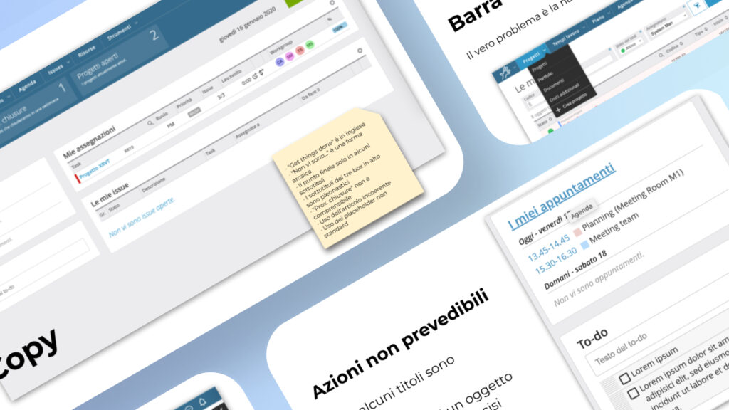
Study and Analysis
Identifying the roots of inconsistency to guide a focused redesign strategy.
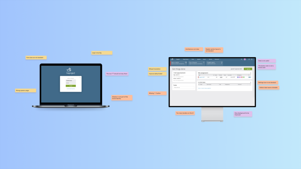
The initial phase involved a comprehensive analysis of TwProject’s existing interface to uncover the key issues:
- UI Inconsistencies: There were major discrepancies in font sizes, spaces, and proportions, leading to a fragmented look and feel.
- Content Design Issues: The lack of standardization in copy and unclear clickable text created confusion.
- Navigation Problems: The top navigation bar was not intuitive, and the overall app architecture was difficult to follow.
- Aesthetic Shortcomings: The dark grey background and mismatched primary color undermined the visual appeal of the tool.
This analysis provided a clear direction for the redesign, emphasizing the need for consistency, clarity, and a more modern aesthetic.
Redesign Strategy
Prioritizing simplicity to improve functionality and user satisfaction
The redesign strategy centered around three core areas: UI improvements, architecture enhancements, and dashboard reorganization.
This strategic approach ensured that the redesign not only improved the current user experience but also provided a scalable foundation for future developments.
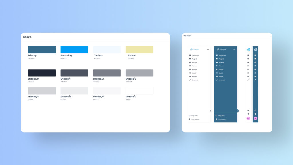
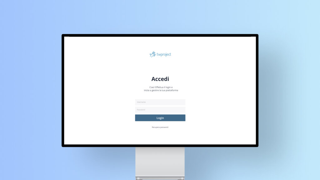
Design system
A new, softer color palette was introduced, with secondary and accent colors to add depth. The typography was redefined based on mathematical principles to ensure a clear hierarchy and consistent styling.
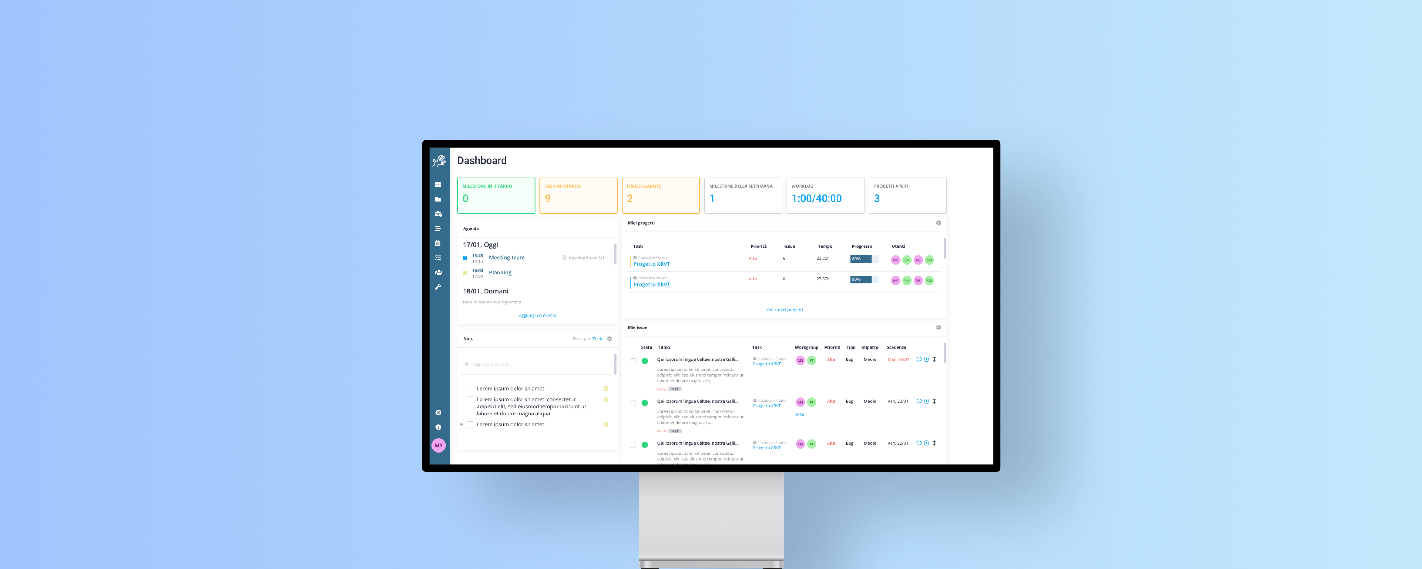
Architecture improvements
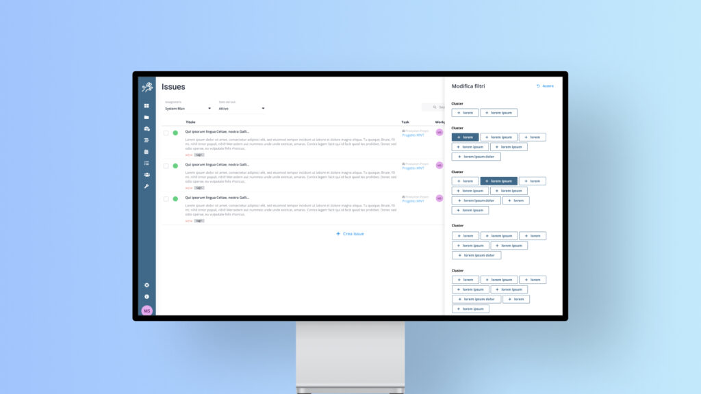
The navigation system was redesigned, replacing the top navigation bar with a more user-friendly sidebar. A unified navigation component was added to each primary page, streamlining the user journey through the application.
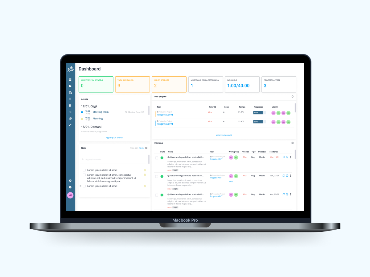
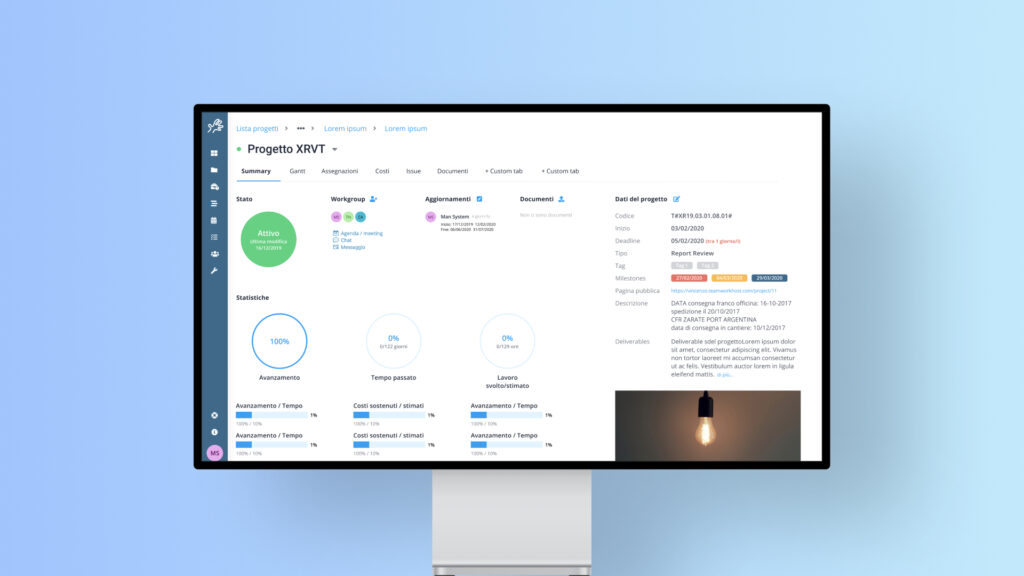
Dashboard
redesign
The dashboard was restructured to present information in a more organized and visually appealing manner. New cards were implemented to display key data more clearly, enhancing overall usability.
Results
Redefining the user experience to set the stage for future growth.
The redesign of TwProject resulted in a significantly improved user experience. The new interface was not only more aesthetically pleasing but also easier to navigate, thanks to the restructured architecture and clearer design elements.
Users reported a smoother, more intuitive experience, which in turn helped TwProject regain client trust and set the stage for future scalability.
The introduction of a scalable design system allowed for ongoing improvements and ensured that TwProject could continue to evolve without losing its user-friendly foundation.